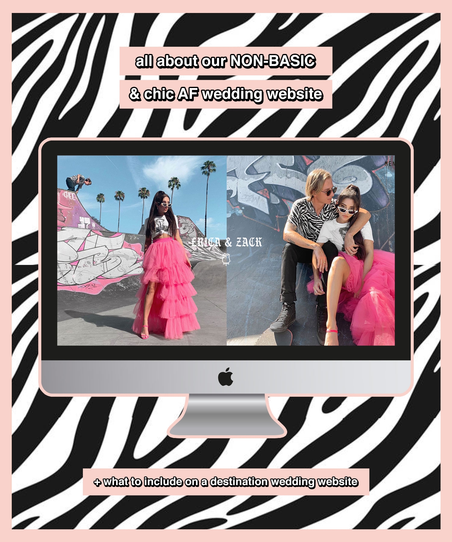
LET’S TALK WEDDING- it’s been a minute, yah?
Don’t worry, the wedding planning is still CHUGGING along beautifully. We have a wonderful wedding planner (shoutout to our lifesaver Nicole at Exhale Events!!!) which really has my job as a bride SO damn easy… which is fab considering I am no domesticated goddess when it comes to planning parties.
What I am good at though is the design stuff. The Creative stuff. Invites, save the dates, aesthetic, & OF COURSE- the wedding website. This is my forte & I am one picky b*tch when it comes to creating a whole vibe.
I spent, kid you not, HOURS browsing different wedding websites. I was on google & Pinterest and all I could find was basic/girly/not my vibe. Don’t get me wrong, basic doesn’t mean unattractive- it’s just… basic. It’s template designs that don’t have a ton of personality & you feel like you’ve seen a hundred times.
It’s fine, but it’s just not me. I want different & I want edgy. I want our wedding website to represent US & the whole mood of the wedding itself. I know it’s just a wedding website to some, but to me- all parts of the wedding contribute to the event as a whole & I wanted even our wedding website to be an experience for our guests.
SO, without further adieu…
MEET BLISS & BONE, AKA HOME TO ALL OF THE NON-BASIC & SUPER CHIC WEDDING WEBSITES!!!
let’s break down WHY I am so obsessed with Bliss & Bone:
♡ FIRST & FOREMOST: you get a 7 day free trial to try it out & see if you like the features. You definitely will, but I love a little try before you buy situation. After that it’s $12 a month for the standard subscription.
♡ YOU CAN USE A CUSTOM URL: this was v important to me because I had an idea for the URL in mind & wanted to make sure we could use it. I’m gonna keep the url under wraps because it’s a live site & although I don’t think anyone would come to Copenhagen to crash our small wedding, YA NEVER KNOW. I can tell you it’s real cute & we used .love & .party for our two different sites (instead of .com) which I thought was a fun touch.
♡ IT’S A WEBSITE BUILDER, NOT A TEMPLATE: this was HUGE for me because most of the sites I saw were just drag & drop templates swapping out stock photos for your own. I can’t with that!!! The Bliss & Bone website builder is easy to use & SO customizable. You can choose from 10 different page layouts, add custom blocks, remove ones you don’t like, & it’s all super user friendly no matter what level of computer expertise you have.
♡ SO MUCH CUSTOMIZATION!!!: literally anything can be adjusted to fit your wedding vibe. You can change colors to any color, they have the most amazing (not cheesy!!!) library of images to use or you can upload your own, & they have the raddest font library (I am a font snob, so trust me on this one!). I had so much fun changing things around to make our site fully ours.
♡ RSVP’S ARE BUILT IN: since we are having a wedding in Copenhagen & reception in San Diego, we will be sending out two sets of invites. I personally don’t want to get bombarded with RSVP’S coming to my house for both events (such a waste of paper!!!!)- so we aren’t having RSVP cards. I think it’s excess & totally unnecessary… which is great because Bliss & Bone has a built in RSVP management system to keep things organized!!
BE SURE TO CHECK OUT ALL OF BLISS & BONE’S WEBSITES HERE FOR MORE EXAMPLES!! They are just so chic & rad.
THE DETAILS OF OUR WEDDING WEBSITE DESIGN:
It’s fun- right? Not a succulent to be found on this site!!! What is it with weddings & succulents? Again- no shame, succulents are great… but you just see SO MANY succulents on wedding websites these days.
Like I said, we wanted our wedding website to be an experience & to me that means: fun to look at, aesthetically pleasing, easy to navigate, & covers all the bases without being too overwhelming.
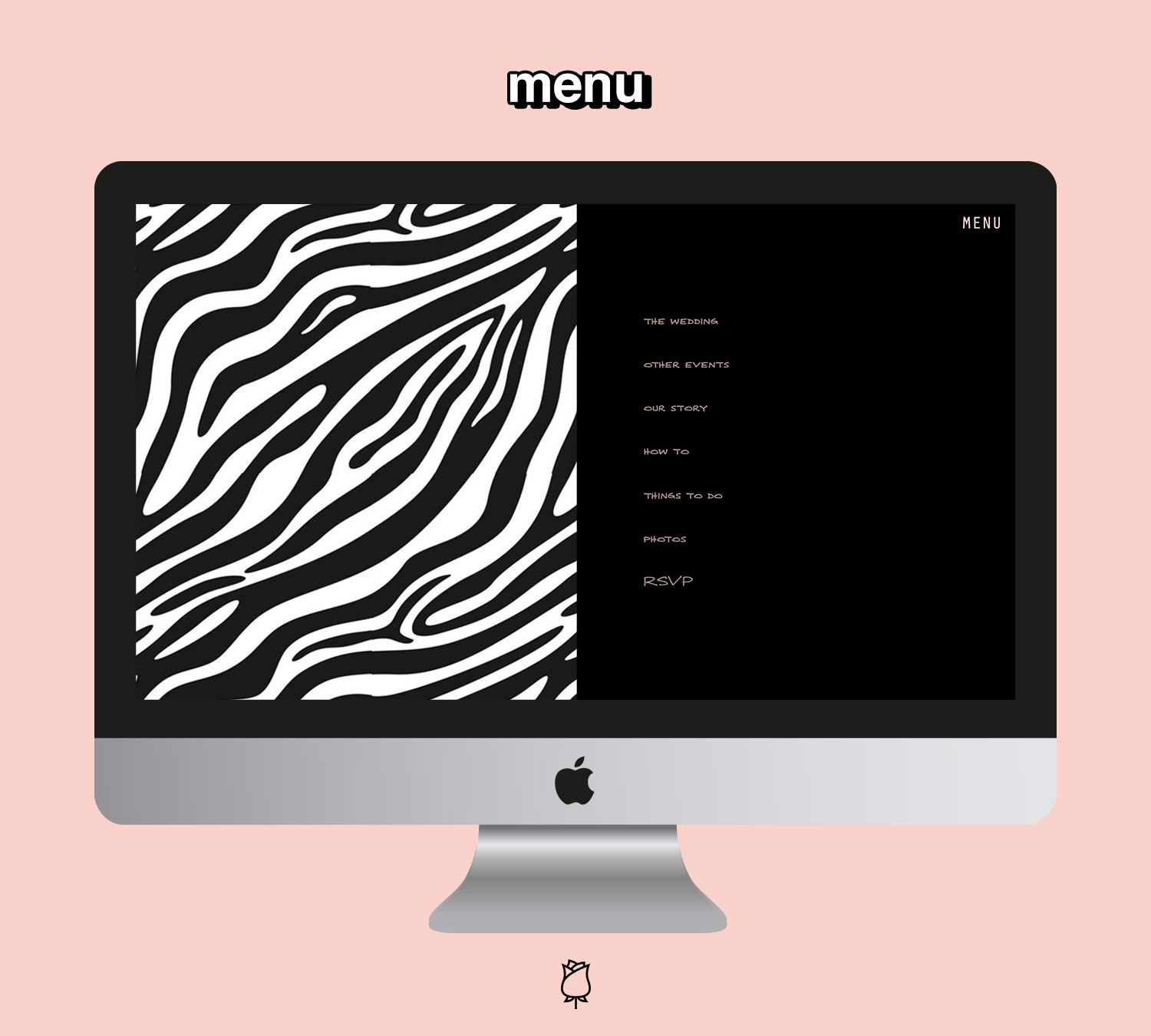
On the home page I wanted to feature our rad engagement photos because they really captured both of us SO damn well (thx to the talented Cindy Romero for these epic photos!!) & opted to tie in the zebra from Zack’s shirt on the menu. I thought that was a FUN little touch.
Other than that pattern pop, we kept the colors cohesive with our wedding colors of black/white/peach… a color combo I personally am obsessed with. I also incorporated the cloud design from the Bliss & Bone library to add a little texture to the site.
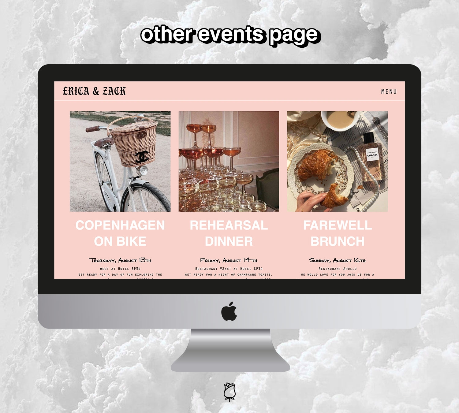
& LASTLY- here’s what to include on your destination wedding website:
navigating a destination wedding is a whole different ball game, even when it comes to the website. I wanted to quickly break down what we felt was important to include on our wedding website in case your planning a destination wedding a need a little roadmap on where to start (I know I did!)
♡ THE WEDDING DETAILS: this is a given, but make sure the details of the wedding itself are listed somewhere clearly. We dedicated a page to this that literally says in huge letters the date, time, & location.
♡ OTHER EVENTS: second to the wedding details, this is the MOST important page for a destination wedding. When planning a faraway wedding, you probably have some events planned for the group around the wedding. We have a Copenhagen bike tour planned, rehearsal dinner, wedding day, & day after brunch. The FIRST question people started asking us was “what other events will there be for booking my tickets”- so make sure you have the dates for this all spelled out so people can plan their travel accordingly.
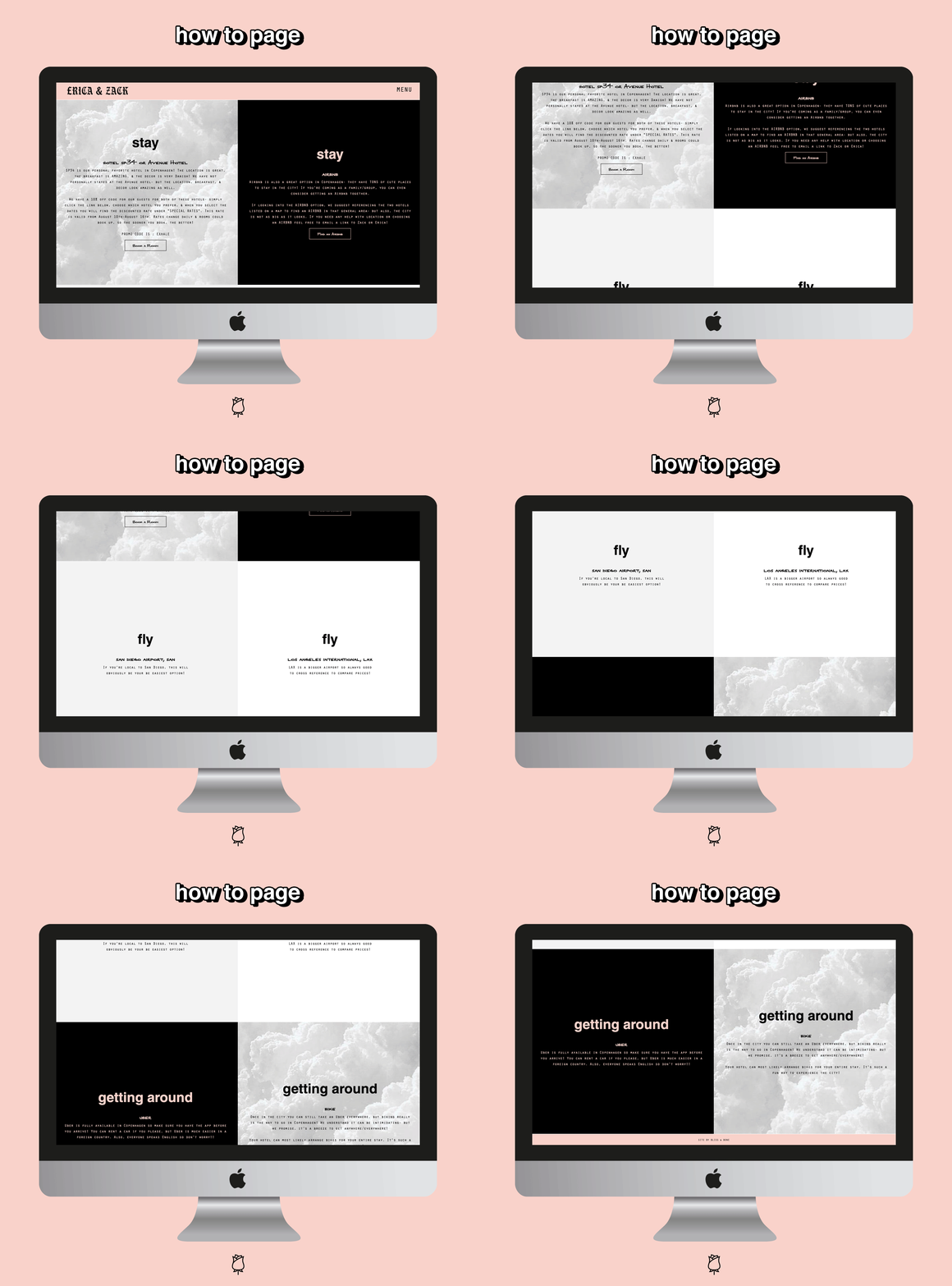
♡ HOW-TO: this is the page where you give people instruction on how to get to the destination, where to stay, any hotel block promo codes for your group, & any other tips needed at their final destination. We included transportation for when you are in Copenhagen (bikes or uber).
♡ THINGS TO DO: I think this is always nice for a destination wedding website. We have been to Copenhagen so many times, so I had a ton of places I wanted to recommend to my guests!! If you’ve never been to the location, do some Google research & have some recs ready to go for your guests. It’s polite & I think esp. important if you’re planning a wedding in a foreign country.
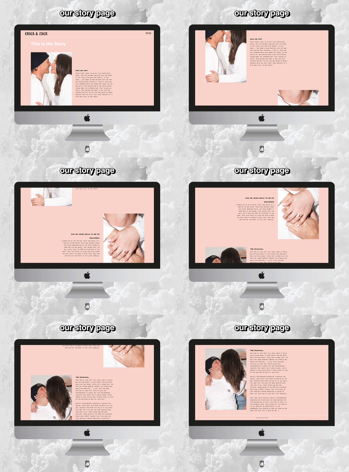
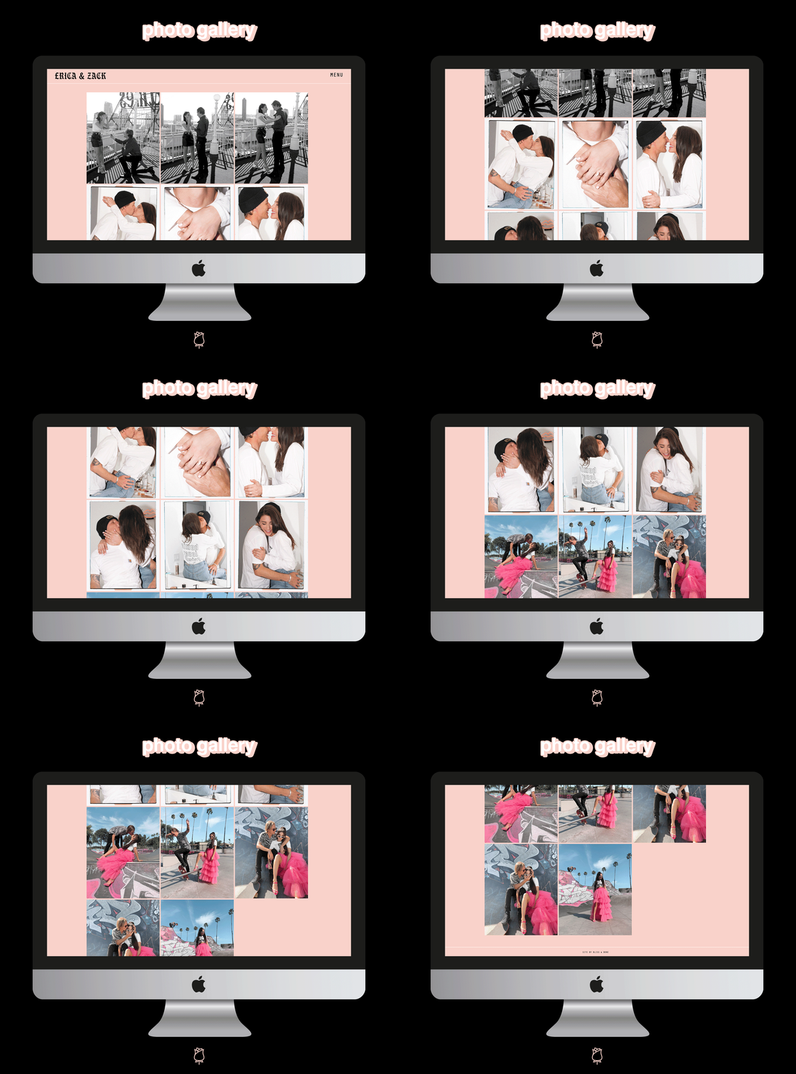
♡ PHOTO GALLERY + COUPLE’S STORY: these aren’t necessarily destination wedding website specific, but I love when wedding websites have this personal touch. I always read the wedding website love stories & the photo album is fun for the guests to see your love story :).
♡ RSVP’S: as mentioned, we aren’t doing paper RSVP’S so we are really utilizing the Bliss & Bone built in RSVP management tool. If you are doing paper invites, I still think this tool could be utilized for the other events surrounding your wedding weekend. It’s just a great/easy way to keep track of who is coming to what.
♡ REGISTRY (OPTIONAL): the jury is out on whether a destination wedding should have a registry & we personally aren’t having one. We WILL have one for our San Diego reception, but I think someone coming to Copenhagen for us is more of a gift than we could ever ask for. If you are having one though, you should def include that!
OTHER WEDDING POSTS TO CHECK OUT
♡ ask the wedding planners | planning a destination wedding ft. exhale events
♡ my only bride tip so far: keeping your diamond sparkly af w/ the dazzle stick
♡ my engagement ring details & the process!
♡ we’re engaged!!!!! our love story + the proposal
♡ 5 *easy af* tips for planning a stylish & sustainable wedding
♡ a wedding update: we finally made an *official* plan + a little planning bts
♡ first thoughts on wedding dresses + my wedding dress mood board
♡ the 8 important things i learned about wedding dress shopping
