Oh heyyy guys– happy Wednesday (we’re half way there!!).
Today I wanna talk blogging, cause I love talking shop, & also cause I have actually gotten a few requests to talk more about creating a brand & a pretty site (v. excited about this question & all of the blog topic requests!!!).
On top of Fashionlush, I also run a blog design company, blog-doo, w/ my best friend & fellow blogger, Lauryn Evarts of The Skinny Confidential.
Quick background story: three years ago Lauryn & I we were working at coffee shop & began talking about our joined obsession with branding & beautiful site design- a service we both needed for our personal blogs, so that day… we created blog-doo.
Fast forward to current day… to say I eat/sleep/and breathe the stuff would be an understatement! Honestly though, I am just very passionate about creating cohesive branding for bloggers, as I feel it is the key component from taking things to the next level.
SO- without further adieu, I am breaking down the why & how of branding for bloggers, along with sharing a personal example of BAD branding!
Why Having a Cohesive Brand is Important
1. Helps you know what your niche is: the first step in branding is always to create a mission statement & a vision statement. You can write this down or just think it, up to you… but the mission statement is just a quick intro to your brand- why you are blogging right NOW, while the vision statement is your “down the road” concept- where you expect to be when you’ve picked up steam & grown a loyal audience.
Doing this will help you narrow down the content you will be focusing on, and therefore finding your niche. I have said it before, but I will say it again, you’d rather be a big fish in a small pond versus a small fish in a big pond. Start small & grow, because if you start too big, you will get lost in the crowd.
2. It’s efficient: at the end of the day, being one with your brand makes the whole blogging thing a lot more streamlined. From the start you should have determined the colors, fonts, graphics, design elements, & voice that you want to reflect your blog or business, so down the road you don’t have to think which fonts to use, what color looks best, or what kind of content you want to be putting out there. That’s all been decided, which leaves you all the time to create beautiful content.
3. It makes you stand out from the rest: we all know, first impressions are everything. When working with brands, showing them you have put a lot of thought into a cohesive experience (including a well design press kit that matches your overall brand) will definitely be that extra *something* that could influence a brand to choose you versus someone with a vision that is all over the place.
Your goal should be that whatever social media page or image your readers on land on, they know it came from you due to fluidity of your graphics, voice, photo editing, content, & so on.
4. It shows you’re a trustworthy resource: the ultimate goal with branding is to provide an enjoyable & easy to understand experience for your audience, which in turn makes your audience trust you & become more loyal to you. It shows you are dedicated, professional, & that you take your work very seriously. You trust professionals, it’s just human nature.

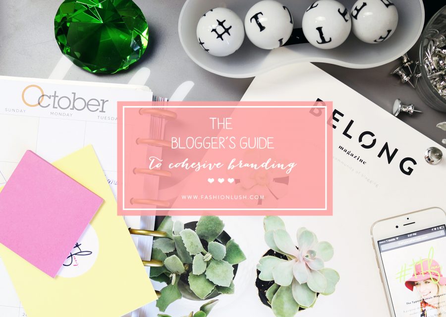
++ just a quick example of bad branding: I whipped up this alternate image for the main photo of this post & as you can see it is off base from the whole vibe of my site. The colors, the photo editing, the icons used, & the font style. Yes- it’s aesthetically a pretty image & cool graphic, but just SO not on brand for me ++
How to Build a Cohesive Brand
+ create a Pinterest inspo board: at blog-doo, our blog design company (if you didn’t know), the first thing we have our clients do is gather inspiration on a Pinterest board. This helps you look at the big picture & determine a theme so you can narrow down the type of logo you like (colorful, boho, minimal, etc.), color scheme, font choices, & overall image you want to portray.
Speaking of logo, you will need one main logo, a secondary logo, & a site icon (very small, so something that will stand out & represent your brand, even at a tiny size!). Your logo is of upmost importance as it is the first thing people see when landing on your site, so even if you have just a small budget, allocate those resources to a good graphic designer.
+ know your audience: even if you don’t have an audience just yet, dream up your ideal audience, & base your branding off of that. If you want edgy young ladies visiting your site to shop your outfits, consider a modern & clean vibe. If you are looking to target girly girls with a makeup or beauty blog, a feminine route with pops of color & bright photos may be better for you. If you are looking to target both men & women, keep things gender neutral. You get the point… know your audience & cater to them.
Think about the purpose of your site & how you want people to feel when visiting your site as well- do you want them to feel excited, at home, cozy, entertained, informed?
+ design details: the big ones you have to consider are fonts & colors… so that’s what we will be covering.
I am a huge font hoarder & a stickler on the kind of fonts I want on my site. I like a very clean & easy to navigate vibe, so you will see most of my fonts are either san-serif or serif’s and absolutely no handwritten elements (although I love the look of that, it’s just not the look I am going for personally). I keep my fonts completely cohesive throughout the blog, using only 4 fonts total, & I also use those same fonts on all graphics I create for the blog. Again, knowing your audience will best determine what fonts to use- food bloggers may want to keep it clean with lightweight serifs while a bridal blogger should definitely opt for a flowy cursive incorporated into their branding.
As for color, this is where things get fun. There is a whole psychology of how different colors invoke a whole variety of different feelings, which is why color theory is so important when it comes to marketing your blog & building your brand.
Refer to your Pinterest board & see if you see a color theme- are you more keen on bright poppy colors, or is muted more your thing? Once you narrow it down to a palette, remember how you decided you want your readers to feel when visiting your site, & do a little color theory research (this site is my personal favorite) to help narrow down which hues will be best for your brand.
I say keep it limited to six colors or less, and before building your site, decide what colors you envision where (headers, links, icons, graphic elements, etc.). Also, always be sure to save the hex codes you end up deciding on so you can use them in the future!
+ make a branding board: …or hire someone to do it for you (ahem *blog-doo*). Now that you have determined your colors, fonts, & overall feels… put all this in one place. Your branding board should include: color palette, font pairings, logo variations, graphics, patterns, etc. Having this available to you on the daily & referencing it often will help to make sure your branding remains cohesive.
+ photography style: unfortunately, low quality snaps just won’t cut it when blogging professionally (although you don’t neccesarily need a good camera, cause iPhone’s are killing it these days!). In blogging, the photos are what stand out the most visually, so it’s important that they too are cohesive.
You want to make sure your editing is the same across the board. As you can see, I go for a more contrasted/less saturated vibe, but some bloggers may do well with bright photos & tons of color. Again, the editing of your photos should match your brand so always put that into consideration.
If you are taking photos yourself of say, meals you prepare, keep the way you photograph cohesive as well. If your food shots are shot from a birds eye view, make sure they all are. If you are a fashion blogger & have someone else taking photos of you, I suggest sticking with one photographer whose style resonates with yours & not straying. They have a brand too, so that will help make sure your photography style is consistent.
+ social media fluidity: I have talked about social media branding before, most specifically for Instagram, which is obviously very important… so let’s chat about that real quick. Instagram is all about the visuals, you can read this post for my VERY detailed tips on how to create a cohesive feed + how I edit my photos, but to sum it up- download an Instagram planning app, keep the filter the same (make sure to match the image editing of your Instagram photos to the ones on your blog- this site has great ‘filter recipes’ to help you edit), & mix things up (don’t post the same exact mirror selfie everyday!).
As for the other networks, those are often forgotten, but also need to flow with your overall brand. Make sure your banners used on Facebook/Twitter/Bloglovin’/etc. match the ones on your site site & I always suggest setting the main photo of you so that the brand appears personable to your followers (always good to put a face behind a brand when blogging!).
I hope you guys enjoyed this post & let me know if you want more blogging content/any specific post you want to see. If you have any design requests, check out the blog-doo site, we are taking on new clients!
x, E
p.s. if you’re a blogger, comment your site below- I’d love to check it out.
