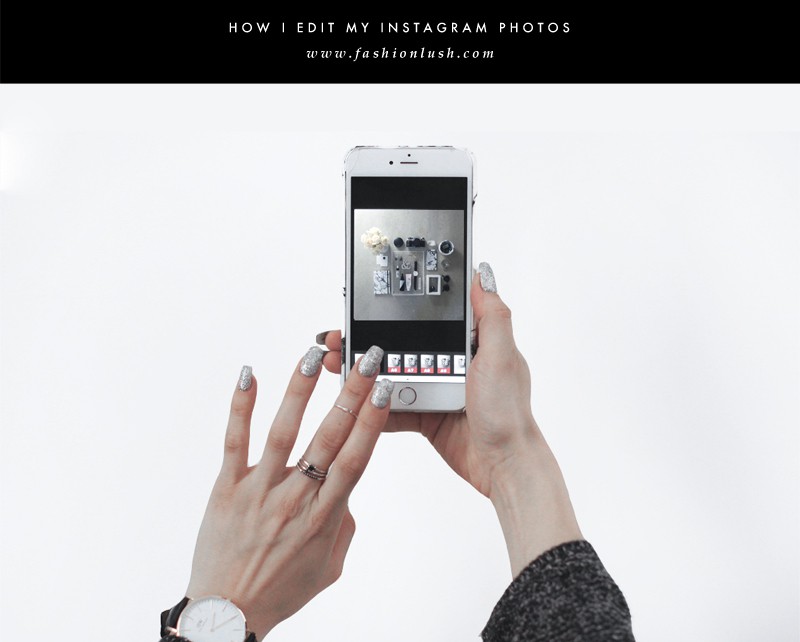
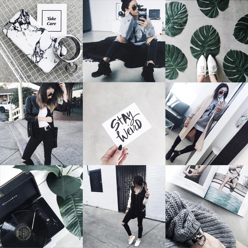
A lot of you have been commenting on my Instagram lately requesting I share how I edit/filter my photos, so… that’s the plan for today!
Honestly, I’m so flattered you guys like my feed. I am not scared to admit it, it takes a lot of work & planning, so it’s always rad to hear you guys are feeling it!
The other day my sister was over & she was rushing me to go run some errands with her, & I told her I had to post an Instagram first. Zack chimes in from the office suggesting Whitney (the sister) kicks off her shoes, grab a snack, & starts catches up on my DVR’ed episodes of Ellen.
I’d like to say he was being sarcastic & exaggerating in a big way, but he wasn’t. The Instagram struggle is real… & very time consuming.
I used to not spend as much time perfecting the feed, but ever since I began branding it more, my follower count began to grow rapidly. So, I soon realized that no matter how long it took me to post a great photo, it is just another part of the job description when you’re a blogger.
Fashionlush is very minimalistic & monochromatic, & since my Instagram “theme” is an extension of my brand as a whole, you will also find that same vibe on my feed.
That said, my theme may not work for your brand! If you’re a home decor blogger who features tons of bright colors, you will have to do some work finding what works best for your personal brand, most likely a vibrant filter to bring that pop of color vibe to your theme.
Regardless of how you decide to edit, a few quick suggestions to help you brand your Instagram:
» Always edit the same each time! Consistency is key in keeping your feed streamlined & stunning.
» Look at your feed from a thumbnail view to analyze how it looks as a whole. This is a great way to see if your theme is cohesive.
» Download the app Lipix & plan ahead. It’s a collage app & I use it to layout my Instagram photos in a 3×3 grid before posting. I know, it sounds crazy/excessive, but it’s been a really helpful tool to make sure everything is cohesive.
» Break up the feed. Don’t post straight up outfit posts all day, break it up with what you’re eating/the color of your nails, a shoe of the day, etc.
» Texture & props are your friend! Brick walls, cobblestone floors, & furry blankets are my personal favorite textures & my favorite props (mainly for flat lays) include succulents, sunglasses, marble anything, pretty flowers, & the occasional crystal.
Now, drumroll please, my in depth editing process.
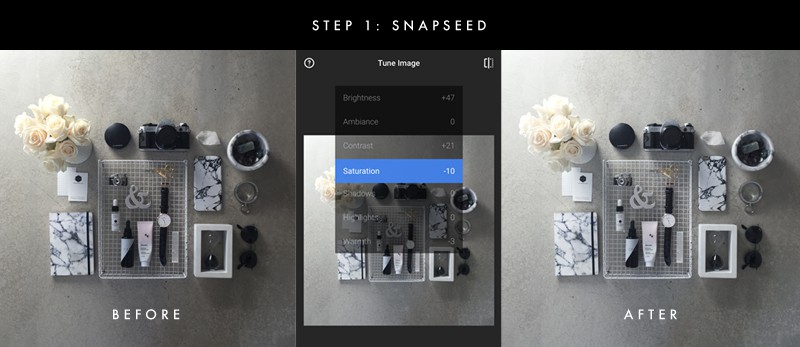
Once I’ve narrowed down from likely 50+ photos, I open up the chosen photo in Snapseed. Snapseed is a great photo editing app as it really lets you closely control the adjustments made to your photo.
» First I up the brightness anywhere from +30 to +50. It all depends on the photo, sometimes it needs a lot of brightening, other times just a tad.
» I then adjust the contrast between +20 and +30. I feel like this helps make the photo pop a bit more.
» Because my brand is very monochromatic, I always always decrease the saturation to about -10.
» Lastly, to keep my photos very cool toned, I down the warmth from -3 to -5. This is very subtle, but makes a huge difference to knock out any unwanted orange/yellow from the photo.
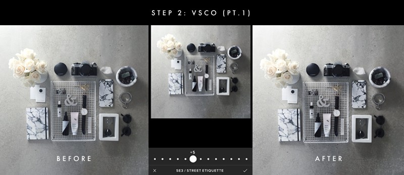
Now that I have my starting edits done, I then open the photo in VSCO, which is my absolute favorite of all editing apps out there.
» In this first round, cause we will open it up in VSCO again in the next step, is to use the SE3 (street etiquette 3) filter. This one you do have to purchase, but it’s totally worth it as it decreases saturations & ups the contrast to the perfect amount.
» Depending on the photo, I will move around the levels. Sometimes full blast with this filter looks great, but more often than not I adjust somewhere between 5 and 8.
» Save the image!
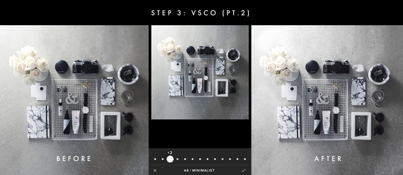
Open up the latest version of your photo again in VSCO to add one more filter.
» I love the A8 feature, because as the name states, it’s very minimalistic & I love all things minimalism
» This filter realllly decreases warmth & adds a bit of a fade to the image. For this filter I set the levels to around 2 or 3 so that it’s not too drastic. Full strength on this one can sometimes look too blue or over edited.
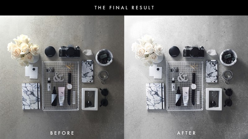
As you can see above, the difference isn’t major, but it definitely looks cleaner, more desaturated, cooler, & all around better.
One other thing I occasionally is when I go to upload the photo to Instagram, I use their built in editor to make any last minute changes. If it is still looking to dark or warm, I will up the brightness & decrease the warmth a bit more. If it is a product photo or a flat lay, I will also give it a bit of sharpening to really make everything stand out!
SO— There you have it! My editing process, in all of it’s full & extensive detail. Hope you guys enjoyed this post & let me know if you want more posts on Instagram branding/tips to grow your following!
You can follow me on Instagram here & be sure to also sign up for the newsletter to receive exclusive access to some of my top secret editing/branding/blogging tips
x, E

