AESTHETICS are my jam…. almost to a fault. I am pretty OCD when it comes to my aesthetic.
But, let me tell you… it’s been a journey for sure. Looking back on some of my really old content makes me cringe sometimes. What was I thinking with that outfit? That editing style? THOSE GRAPHICS. Major *face palm*.
If it wasn’t for SEO, i’d probably delete all my old content. Actually, I have deleted some of it… & then got a slap on the wrist from my SEO girl because I guess that’s a no no.
But, I am getting off track.
The reason this post came to be was actually due to a question that slid into the DM a few nights ago. A lovely lady messaged me wanting tips on creating a cohesive Instagram feed. She said she was in love with my black & white minimal theme, but she has noticed that I have started to incorporate more color into my feed… yet still have maintained it’s cohesiveness & wanted some tips.
This peaked my interest BIG TIME.
Yes, I used to have a strictly black & white theme. This aesthetic served me well for many years & is a very easy way to create a cohesive feed because black & white is just black & white. It matches & looks good together, no matter what. I loved the minimalism & I loved the white space, but eventually- color was calling my name & the black/white vibe was actually holding me back.
Honestly, transitioning my feed & aesthetic in general was a real change of pace for me. I was fearful, but I was wanting some more depth to my feed. I wanted to achieve something more artsy, more interesting, & have been really loving a vintage feel lately.
So, I went for it, & have never been happier with my overall aesthetic. I feel like I finally know my branding & have been having so much fun with it. Plus, now that I really know what I like, taking photos & creating content is so much easier & so much more fun.
Not to mention, finding your own aesthetic & sticking to it really helps you stand out from the crowd… & that is one of the key components (IMO) to memorable & succesful branding.
HOW TO FIND YOUR AESTHETIC
1. First things first, who are you?
A good starting place is to look within. What’s your overall personality? At the end of the day your brand & aesthetic needs to fully represent you. One look at your Instagram feed as a whole, or your blog, should tell someone a quick story of who you are. Life is all about first impressions, & same applies in the world of business, branding, & social media.
Are you bright & bubbly? Artsy & kinda moody? Do bright colors in your house make you feel happy? Is your decor style more minimal? Spend some time looking within & thinking what makes you YOU.
Writing things down always helps me really make sense of my thoughts- so make a list of things you like & things you don’t like. This small practice can help you really hone in on what you are trying to portray.
For example: I like to think I am a bit artistic, edgy, & a little out of the box. I want people to see that sense of creativity when visiting my site or my Instagram account for the first time.
2. How Do You Want People to Feel?
What is the message you want to portray with your aesthetic? This is a BIG ONE. Do you want people to feel inspired, artistic, creative, happy, spiritual?
Obviously, this should align with your content, but images can really make people feel a certain way, so knowing that going into it will help you tremendously. What is the message you are trying to convey to people? Note how you feel when you visit certain blogs or Instagram feeds & think about why you feel that way.
For example: I hope my feed inspires people to be themselves & to think outside the box. I want people to feel that doing YOU is a good thing. To not follow the crowd because you think it’s the “right way” to do anything.
3. Create a Mood Board
MY FAVORITE THING EVER. I am a big fan of a good mood board. Again, I am super driven by aesthetics, so although putting things down on paper helps, it’s when I put a bunch of images together that I can really see what I like.
A few ways to do this would be to create a Pinterest board with images that inspire you, or to create a bookmark folder on Instagram (obsessed w/ bookmarking on the gram!). If you are good with Photoshop, you can also whip something up there.
Also- use the app SNUG to layout images in a grid that looks just like Instagram. I use this app for planning future posts, but it can also help with honing down on an aesthetic.
Just seeing it will help you recognize trends of things you like. Are you seeing lots of color? Lack of color? Do you like photos with depth or lots going on? Do you like more minimal photos? Are you loving flatlays or street style shots? Do you like when style photos are broken up with more inspirational photos? All of these questions will be answered when you mood board your vision.
For example: through creating a mood board I realized I love artsy photos, street style content, & I also learned I love taking photos at night with a flash. I also learned I really love a film look when it comes to my photos!
4. Creating Content, with Purpose
Okay- another question the lovely lady asked me when she messaged me was do I dress to match my feed. I LOVE THIS QUESTION.
The answer would be: to an extent, yes, I do dress to match my feed… but I am not doing it intentionally. Now that I am fully content with my branding, my style just works better. Before, when I was all black & white, I had to actually try harder to match my feed than I do now.
For example: if you look at my current branding, you will notice there is lots of red going on cause I am LOVING red lately. Do I wear more red because of this- absolutely, but not neccesarily to match my feed… just cause I like red so it goes hand in hand.
Same goes for my non-outfit photos, being more drawn to red, I noticed I have red roses in my house which I love adding to a photo, or even a red shoe in a flat lay gives me all of the feels. Just a little pop of color to tie it all in works wonders for me.
If you are in a world where branding is big (so, everyone), it is important to create content with purpose! You really can’t just post any picture & expect it to work, it takes some thought… but if you have honed in on an aesthetic, this process is so much easier.
5. All About the Edit
At the end of the day though, it’s literally all about the edit. I personally edit majority of my photos in Lightroom & have created specific presets that I use religiously. This really really helps keep things cohesive. If you have Lightroom, there are tons of presets you can buy & then tweak to your liking, & once you get more accustomed- you can start creating your own presets.
This also carries over to social media as well. I am not always able to edit on my computer when on the go, so I have a few filter routines on VSCO cam I also use religiously. Sometimes I even have to filter my Lightroom edited filters to match my Instagram feed.
All of the above tips will help you also figure out the edit you are going for- dark & moody, bright & sunny, artsy, vintage, edgy, etc. etc.
If you like my feed, here are some of my top posts on how I edit my photos:
☆ How to Create a Cohesive Brand (an extension of this post!)
☆ How to Desaturate Background in Photoshop
☆ How I Edit my Instagram photos (this was when my feed was more desaturated, but I am working on an updated editing post!)
& if you want more blog tips to help you nail your brand & up your blogging game, you can check out all of my BLOG RELATED posts here! x, E
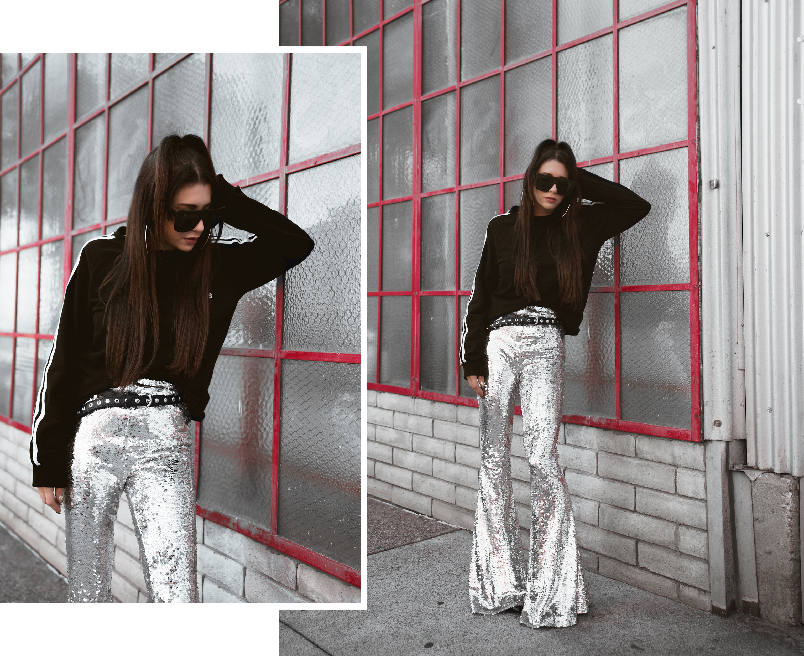
WHAT I’M WEARING:
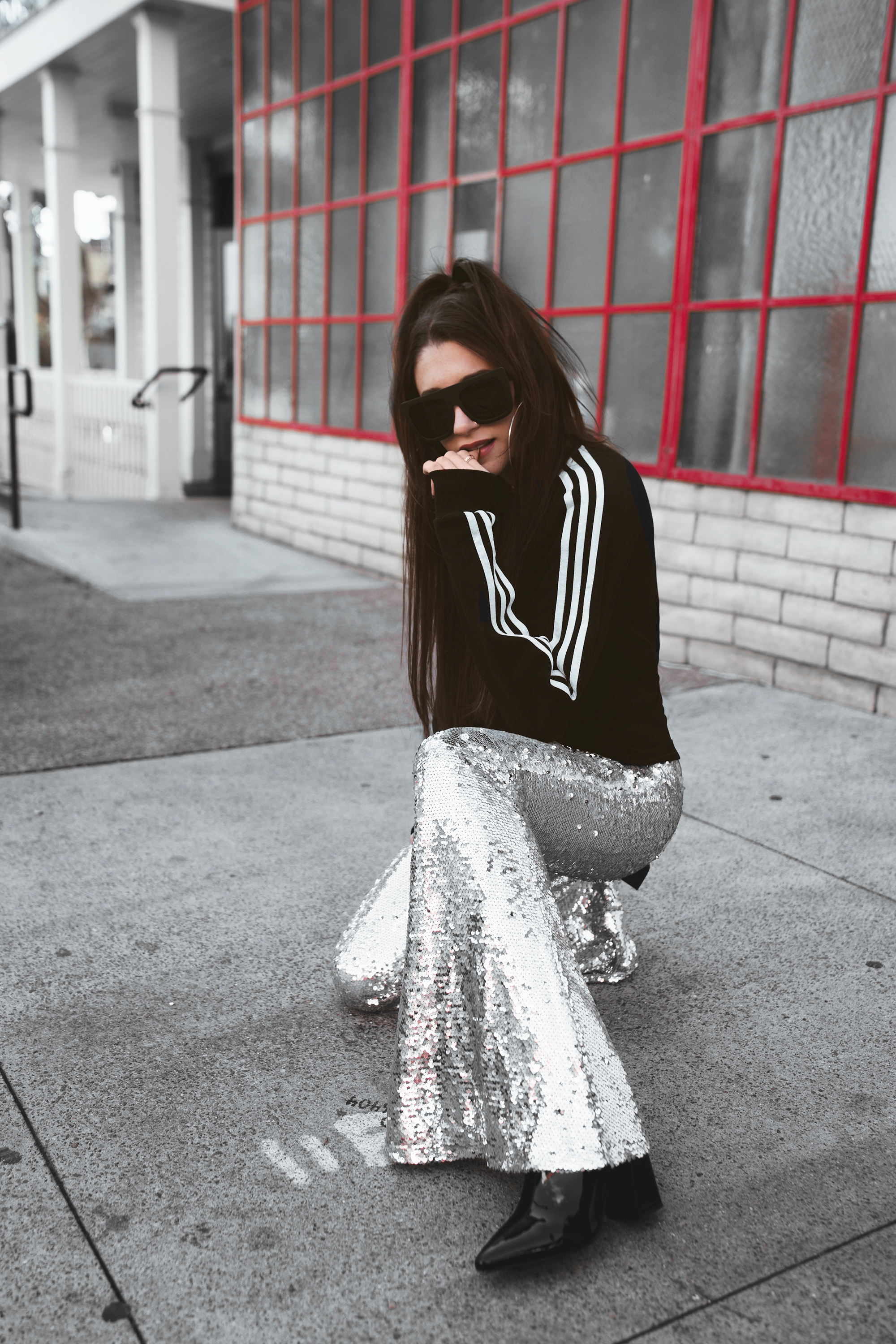
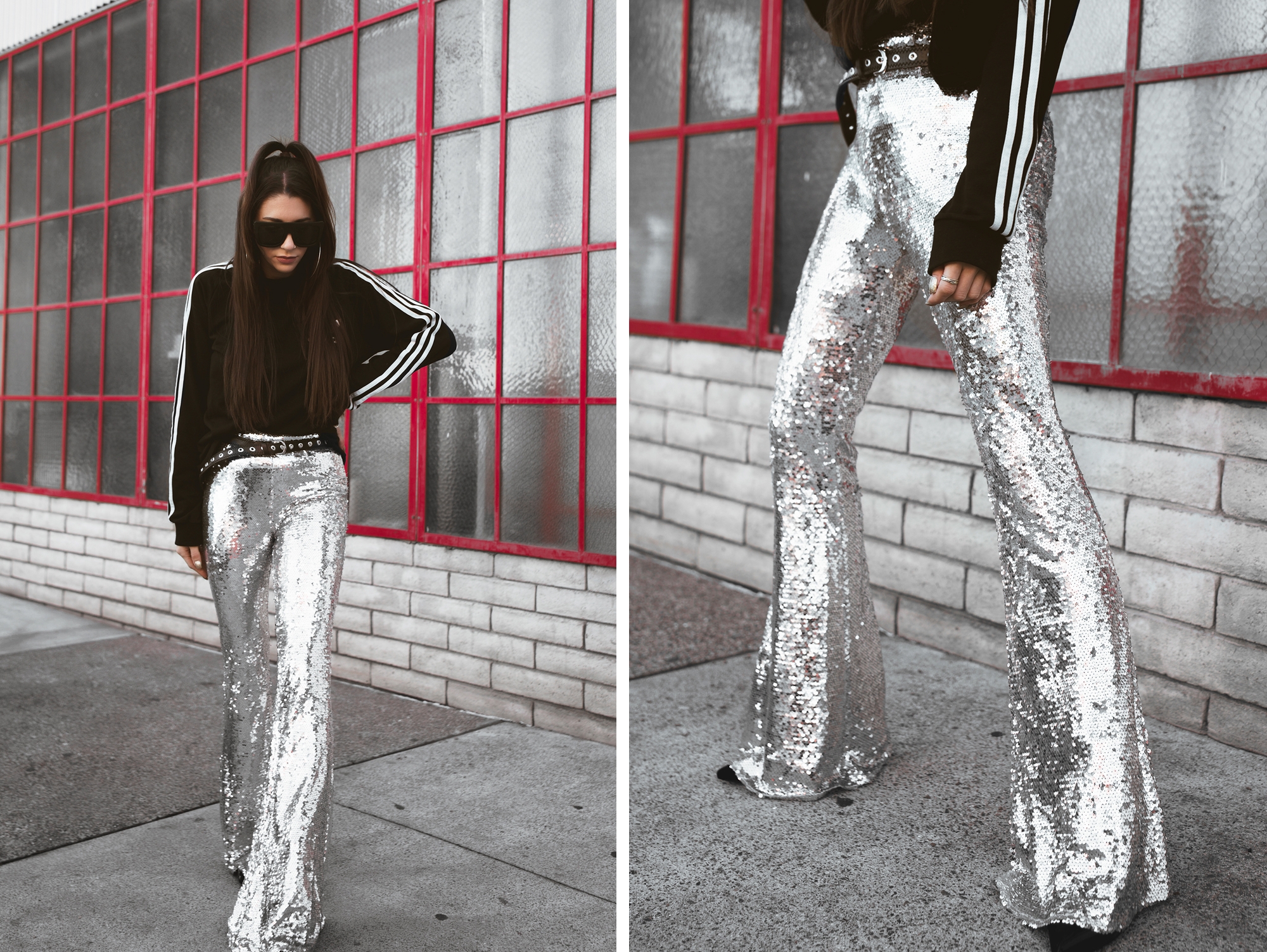
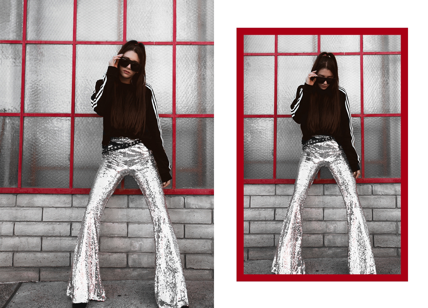
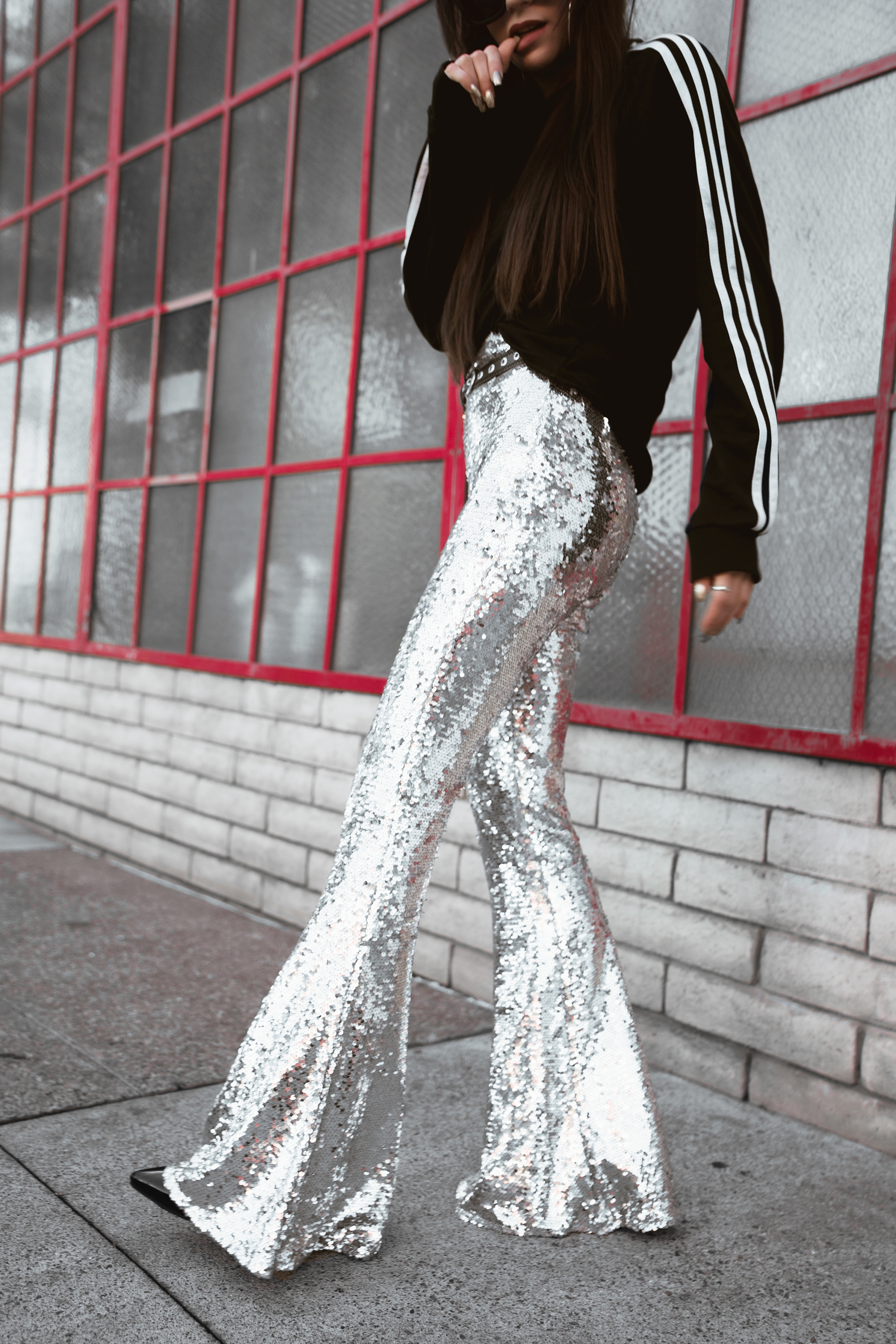
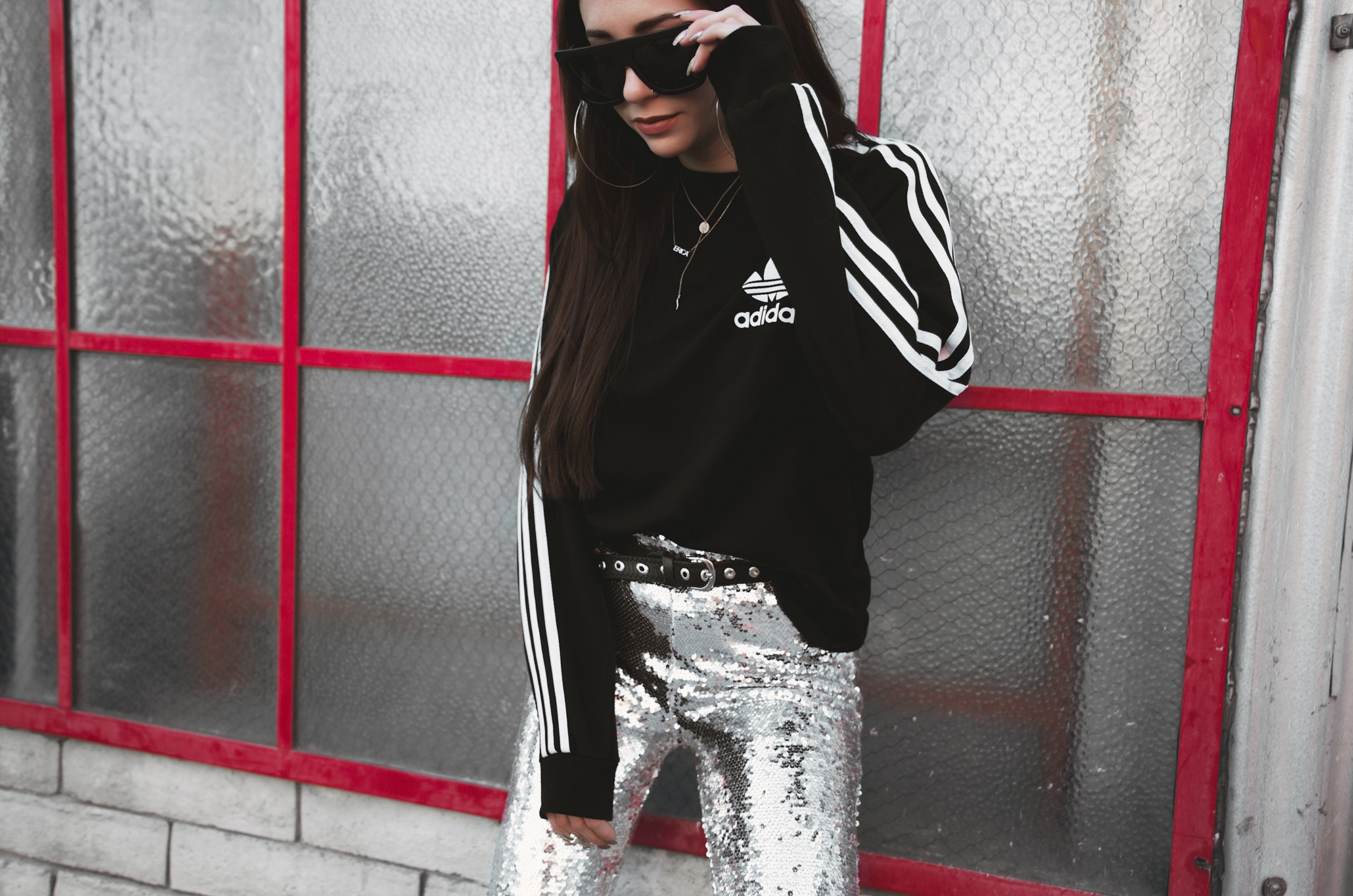
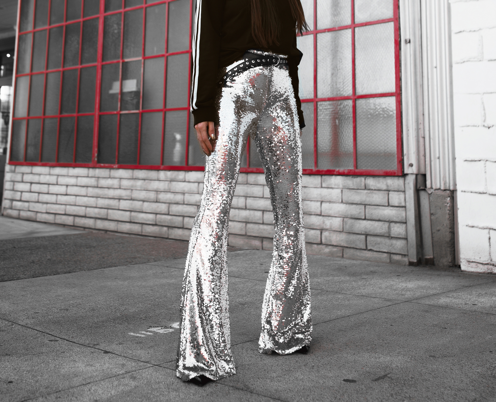
Missguided sequin bell bottoms (sold out- similar here & here) | Adidas long sleeve t-shirt | Public Desire black patent & suede ankle boots | the Fashionlush collection ‘Linda’ evil eye choker & ‘Whitney’ lariat necklace | QUAY ‘Cafe Racer’ sunglasses | grommet skinny belt
the edit | sequin season
[ PHOTOS BY ARIELLE LEVY ]

Thanks love!
thanks love!
Thank you babe! It definitely takes some work figuring out what you love, but once you do, it’s fun!!
I need to create the ultimate Keaton Filter. #dianekeatongoals
yes girl- so into that